Kids Bedroom Interior Design by Mazzali
Kid’s bedroom is usually full of color and ornament, but not necessarily always the case. Mazzali design bedroom for kids with little bit color so make this room elegant. This decoration completed with bookcase to arrange the book.
This is default featured slide 2 title
Go to Blogger edit html and find these sentences.Now replace these sentences with your own descriptions.This theme is Bloggerized by Lasantha Bandara - Premiumbloggertemplates.com.
This is default featured slide 3 title
Go to Blogger edit html and find these sentences.Now replace these sentences with your own descriptions.This theme is Bloggerized by Lasantha Bandara - Premiumbloggertemplates.com.
This is default featured slide 4 title
Go to Blogger edit html and find these sentences.Now replace these sentences with your own descriptions.This theme is Bloggerized by Lasantha Bandara - Premiumbloggertemplates.com.
This is default featured slide 5 title
Go to Blogger edit html and find these sentences.Now replace these sentences with your own descriptions.This theme is Bloggerized by Lasantha Bandara - Premiumbloggertemplates.com.
Sunday, 27 September 2009
Country Luxury Homes
Luxury Home Desigm
Dellis Cay Villa - Luxury home

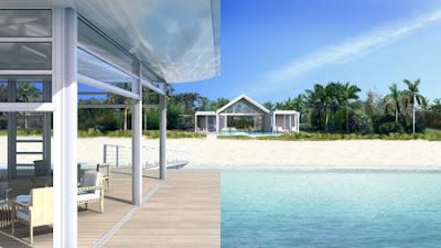 The following information is from Dellis Cay:


Tuesday, 22 September 2009
Underground House - Luxury Home

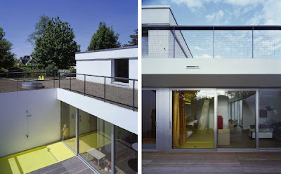


View more information about underground house [via] modern house design.
Thursday, 17 September 2009
Sofa design by the Minnoti Albers
House Presenhuber - holiday house


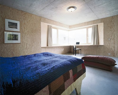


Architects: AFGH
Location: CH-7557 Vnà, GR, Switzerland
Project year: 2006-2007
Construction year: 2006-2007
Client: Eva Presenhuber
Planners: Jon Andrea Könz
Budget: 900.000 CHF (US $866.551)
Constructed Area: 224 sqm
Photographs: Valentin Jeck
source [via] modern house design.
Tuesday, 15 September 2009
Kitchen & Bathrooms Tips Interior Design
● The kitchen sink, cooking stove and the refrigerator should form a work triangle where the total distance of the three stations is no more than 26 feet. The three stations should be close enough for convenience when preparing food.
● Avoid dark colored tiles on shower areas of bathrooms and kitchen counters. Although black or royal blue may look stunning, soap residue can easily be seen and is difficult to clean when hardened. Unless you have a helper to clean the bathroom right after you shower, it is better to use light colored tiles on the shower area.
● Like any other room, if your bathroom is too small use a large mirror on top of the sink or one whole wall - it will make the bathroom look bigger.
● You can also place a mirror in the kitchen. A good place is opposite the window, it will not only make the room larger but it will reflect the light and brighten the room.
● Put small indoor plants on small pots in your kitchen and bathroom. Plants gives a fresh feeling to the interior design of the kitchen and bathroom.
● Don't be limited to stainless steel sinks, drawer handles, frames and pans, use copper, chrome, wrought iron, tin, brass and platinum. They will make your kitchen or bathroom more interesting.
● If you have shelves to spare, put cookbooks, small indoor plants and other accessories to make your kitchen more appealing.
● During holidays change the look of your kitchen by putting themed table cloth and chair slipcovers to cheer up the room.
● Always make sure that there is adequate lighting on bathrooms and kitchen. Inadequate lighting makes the kitchen & bathroom feel cramped and gloomy. Aside from the general lighting fixture at the center of the room. Put task lights under the kitchen hanging cabinets. In the bathroom, put wall lights on either sides of the vanity mirror. The classic style of placing small wall lamps on both sides of the mirror gives your bathroom a charming and elegant look.
● Bathroom interior design can be fun. If your bathroom is big enough, you can decorate it with some framed pictures or artwork. Just make sure that it is not affected by moisture. Pictures or artwork makes the bathroom more interesting. Also put some scented candles, soaps and flowers. They are always a welcome add on -specially to your visitors.
Bedrooms Interior Design Tips
● When interior designing your bedrooms, make sure the rooms are cozy and restful in appearance. Avoid bright colors like orange. Bright colors won't induce you to sleep. Neutral, pastel and warm colors are best suited for bedrooms.
● If you are starting your interiors from scratch, you can start by choosing fabrics first and base the color of you wall from it, then you can select furniture that compliments the color of walls and the fabrics that you are going to use.
● Save on expensive wall decor, go through magazines, art books or even your child's art work at school and have the picture framed. Not only will you save, you will have a unique picture that is not found on commercial home decor stores.
● Consider an extra cabinet or storage space inside your bedroom or den, they are areas that usually invite clutter. It is important to always have your room neat and clutter free.
● Use warm flooring on bedroom floors like wood and carpet. Don't use ceramic tiles, marble or granite on bedroom floors. It is not pleasant to get out of bed in the morning and step on a cold floor. If a cold flooring material is already installed, put an area rug beside the bed.
● If you can, use the same fabric, design and color of the bedcovers as with the curtains. The room will have that "Interior Designed" look.
● If you want to be one with nature as the look you want for your bedroom, go with woven wood shades. These are made from renewable resources like jutes, bamboos, reeds and rattan. Cool, cozy and "green" look is achieved!
● If your room is small, use mirrors on the walls. It gives the room an illusion of space (If you are a Feng Shui believer, see the tips on mirrors).
● For bedrooms and specially dens, put an exhaust fan on the ceiling or wall farthest from the window. It will suck-in the cold air outside and keep the air inside the room fresh and cool. This can even save you electricity bills by not using your air conditioner during cool months.
● Some of us wants our bedrooms to be dark even late in the day specially when we sleep late. Thus some of us put up very dark curtains. Deep colored curtains against a light colored wall comes very strong. It is better to have your walls a shade darker and the curtain a little lighter to lessen the contrast. An alternative is to use two layered curtains instead one that is very dark.
● Aside from the typical center light on the middle of the ceiling, use lampshades, pin lights and up lights for mood lighting. These type of lighting gives dark and light patterns of light in the room.
● 1/3 of you life is spent on your bed. Invest in a good mattress, pillows and cotton or linen sheets -they absorb perspiration better.
● The bedroom is your private space, among all rooms in your home, your bedroom's look and atmosphere should be the most relaxing and reflective of your personal taste and style.
Saturday, 12 September 2009
Alan-Voo Family House
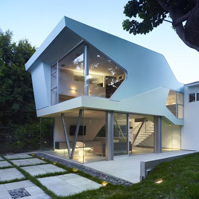
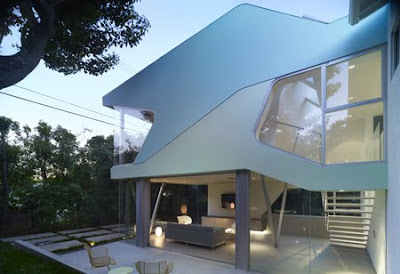
This is a Project Description from Neil M. Denari Architects :


More about Family house [via] modern house design.
Friday, 11 September 2009
Contemporary House by Nicholas Murray
This house is designed by Nicholas Murray and situated in west part of Melbourne, Australia. It was one of the many warehouses in this area but become great contemporary living place. A rustic yet elegant approach was taken to combine the original characteristics of the structure with the refined contemporary lifestyle of its occupants to create a symphony of harmonious contradiction. With a carefully controlled palette of materials, this split level retreat is an epitome of inner city living, commanding a magnificent view over the city and Docklands skyline on its top two levels. The interior is separated for different zones, some of which show almost raw materials while other are covered with modern surfaces. One of the most cool zones that is more modern than others is cooking area in the kitchen. Not only appliances there are made of stainless steel but also cabinets.
Glamorous Four-Square House Interior by Jessica Helgerson
This project is a complete remodel of a turn-of-the-century Southeast Portland four-square. The old space become more practical, glamour and cozy. A small kitchen with a back pantry become big and airy space. Several windows and built-in shelves were also added to make the space more practical. Woodwork throughout the house was done in a dark ebony as were the floors on the first floor. The furniture around the house was chose in the way to create eclectic blend of modern and ethnic styles. Some of the pieces were custom made locally: the sofa that fits into the bay window; the living room chairs which are cozily upholstered in sheepskin; the blown glass sculptures; and so on.


